
Recently I have been battling a bit with how the first and second half of the trailer rub up against each other. They feel very separate, the second half, although only in the rough stage makes the first half feel a little trivial. Almost like a joke, the slapstick nature of the fighting feels comical, very much like the writing that I created at the start of the previous post. So when I was watching a recent documentary about Vietnam, it gave me an idea of how I could link the two halves. The second half definitely needs to be brought into line, keeping the same colour scheme and technique is an important part of this, but because its pretty much the first time you’ll see people in the trailer it still needs to feel connected. The first part has such a dark feeling, that Im wondering whether using more of a war aesthetic would help this process more?
What I have noticed from the documentary is that I am strangely fascinated with violence. The Vietnam war was a particularly violent war, very close quarters, guerrilla fighting, powerful, explosive weaponry coupled with the fact that it was a very heavily documented war has meant it has a very strong, unique look and feel. Although the subject matter is awful, I do find that I am intrigued by this. I am wondering if this is a good methodology for attracting men to this piece, or at least keeping them interested?
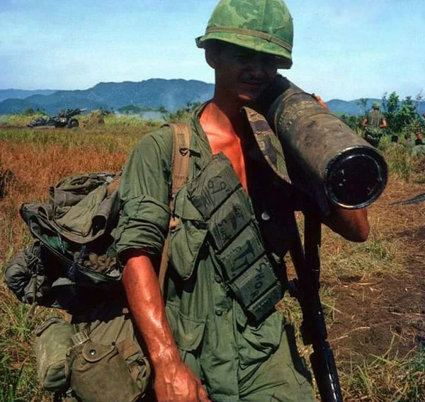
Figure 1.

Figure 2.

Figure 3.

Figure 4.

Figure 5.

Figure 6.

Figure 7.

Figure 8.
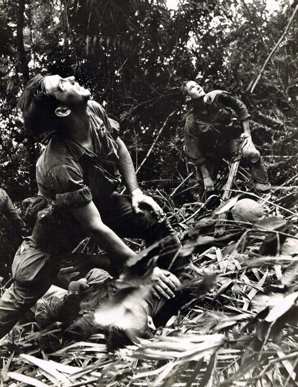
Figure 9.

Figure 10.
Fig. 1, 2, 3, 4, 5, 6, 7, 8, 9 and 10 are all examples of images that represent this certain look that I am talking about, the helmet shadows the face, leaving just the white, almost hollow eyes staring back. Often blurry or slightly out of focus images signifying the feeling of a war zone or this idea of having to constantly move and being bashed about. What I thought I would do is try to get a bit of the feeling of these photos into my artwork, maybe the danger is that im turning off young women, but possibly men should be the intended target anyway as they are the ones who need to change? Does this also become an examination of masculinity? How should men and women act? In the Vietnam war women made up a large proportion of the Viet-Cong, they were capable of just as much brutality as men, so its true to say violence isn’t a male trait. Maybe that brings this in to question more, how ‘Lady like’ should a lady be?

Figure 11.
Fig. 11 is my first try at mixing the two genres, Wuxi and Vietnam war. The slightly odd thing is that this war happened around the same time that the initial films by King Hu were made, that inspired me to do my own Wuxia HKC film trailer. Theres quite a nice connection there I think. I like this image, I like the direction that this is moving in now that I have injected this new topic into the artwork. The motion blur is quite cool, it gives the image a really nice fluid feel and I like how it interacts with the dark background and red bluring. They suggest violence. They suggest protest, war, action.
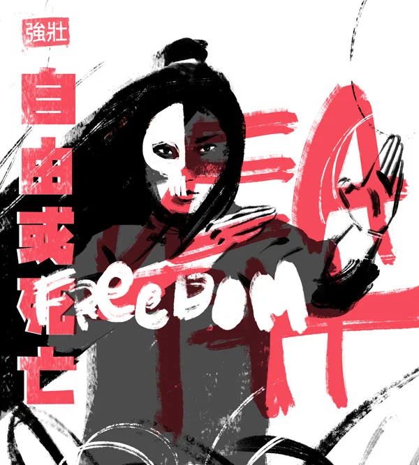
Figure 12.
Fig. 12 is taking the idea a little further, much more abstract. Way more iconography of the Vietnam era, scratchy, hand carved writing almost as if its been etched directly into a helmet. The skull over the face hiding her identity is inspired by artwork for the film ‘Platoon’. Maybe this is a little too far removed, but I do really like the outcome. Next I will try and bring it back to a chinese context a little more. I like the idea of creating an animated film poster working with this new aesthetic. This will be my next step.

Figure 13.

Figure 14.
Whilst I am on the subject of intertextuality, I thought I would mention something I came across in my research. The question that led me to these discoveries was, “how have other people used a war aesthetic in their artwork” Maybe fig. 13 and fig. 14 are a bit literal, in that its actually a film about Vietnam, so its unsurprising that they have been inspired by real footage of the war. However I like that you can see a direct connection between a very famous Vietnam image, and the promotional cover of a film that also became very famous. Was it the link to this powerful image that made platoons poster so visually striking? There is no doubt about it the dramatic pose of the soldier throwing his arms up in the air, as if he is pleading with the all mighty to stop the violence is a very powerful image. And knowing that the original is a man helping another soldier into a helicopter certainly linking to this idea of help from above which much have seemed like divine intervention when stuck in a fire fight in the middle of a jungle. Finding this link makes me think about where I get my source material from, so far it's just stills from various Kung Fu films where women have been used. Maybe I should look to make my own, however this is not doing the same as above, so maybe I should be looking deeper, or taking my own stills from films that have been influential to me.

Figure 15.
Although fig. 15 is an unofficial film poster I think it has all the trade marks of a war aesthetic. The top image fits perfectly with all the photos I shared at the start of this post, fig. 1 - 10. The intense meaningful look out the side of the eyes or over a shoulder as if he is the point man in a column of soldiers seeing an enemy combatant out the corner of his eyes. Couple this with the image below, of what looks like one soldier holding another or ‘brothers’ and you have a really strong war aesthetic. This below image is actually a dad being comforted by his adolescent daughter but you could say that the dynamic between them in the film is one of brothers in arms. Another side to this is that on the blu ray version of Logan, you can watch the whole thing is black and white, or as they call it 'Noir’. Again this is a really nice touch and once more strengthens the war, even Vietnam aesthetic. Last thing on this poster, I do love the blurring of the rain in the top image, adds such a strong atmosphere to the image, maybe this is also a subtle hint towards a feeling of war and conflict as well.