
In early August 2018 I attended an event called DesignInquiry held in the Devon countryside. The event is setup by university lecturers from around the world who come together to present their current research projects then debate and feedback on them. With the current stage I am at with my project I felt it was the perfect time to take part in this. Maybe it was slightly brave to get 15 - 18 different design lecturers opinions…
Screenprinting Promotional Artwork (Image)

The more traditional printing methods such as litho printing, screen printing and although not that old, Risograph printing have been something I have been interested in expanding for some time now. The feel and finish they give lend themselves perfectly to the trailer as it cements that lowfi, hand made feel often associated with…
Vietnam War, to Fight or not to Fight (Image)

Recently I have been battling a bit with how the first and second half of the trailer rub up against each other. They feel very separate, the second half, although only in the rough stage makes the first half feel a little trivial. Almost like a joke, the slapstick nature of the fighting feels comical, very much like the writing that I created at the start of the previous post. So when I was watching a recent documentary about Vietnam, it gave me an idea of how I could link the two halves. The second half definitely…
Title cards and Text (Image)
For the last few months I have been specifically focusing on getting the design for the title cards just right. I feel this falls under the remit of design which is not my strongest area. However after many tests I think I have finally hit on an aesthetic I like and feel represents the trailer perfectly…
Colour Choice and Drawing Style (Image)

Since my previous animation test I have been thinking a lot about how the production might look and why it would look that way. I know that original chinese artwork is largely black and white, or rather black ink. These normally take the form of mountains and hills then accompanying them you will get a poem of some kind written by another person as you can see in Fig. 1. I did a lot of work on this in a previous project, however I didn’t really think about the colours, when it came to creating my own versions of the mountains I just picked a colour scheme I liked as appose to really thinking about why I was using those…
Semiotics and title sequences - Text Image Composites in Motion Graphics (Theory)

in the early stages of this project I was determined to focus on the theory side, I wanted to try and underpin what it was I am doing with some design theory. A quick search in the library yielded this book, 'Semiotics and title sequences - Text Image Composites in Motion Graphics’. Very academic and and quite intensely written, I did struggle at first. The book is however online only, so I could continually come back to it over the course of a few weeks, chipping away at it. Essentially the book is split into 3 parts that of which are different semiotic ways of looking at title sequences to films.
Isle of Dogs (Image, Motion, Sound)

Wes Andersons new film, Isle of Dogs is an absolute marvel. When I went to go and see it initially I didn’t think it would have any relationship with this project but as soon as it started I realised what impact it would have. Although I am not doing my animation as stop motion they use a tone of artwork and illustration throughout the film, and due to the nature of the animation the artwork lends itself to the film perfectly. After seeing…
BICEP | GLUE (Image, Motion, Sound)

Although I am not the biggest fan of this type of music, This video is one of the best examples of image, motion and sound working in perfect unison that I have ever seen. BICEP are a young British Dj duo whose music is heavily inspired by the acid house and rave scene of the late 80’s early 90’s. It is also another great example of visual literacy all pointing in the same direction, focusing the viewers attention on a small, not well known part of the British music scene. I have never been to a rave and was to young to be into this kind of music in the 80’s, but because of...
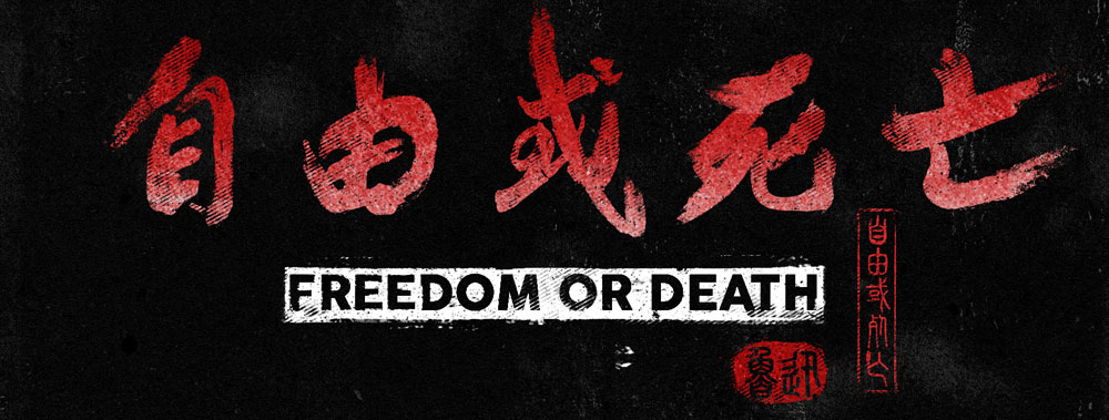
Freedom Or Death Teaser Trailer (Image, Motion, Sound)

Due to the fact that this project was moving on directly from Global Practice, rather than starting completely new, I was able to get on right away with some well accomplished primary research. Below is a short teaser trailer idea that I have been playing around with, the aim is to progress further with the artwork but also to work more on combing image, motion and sound. I didn’t get...
Lady Snow Blood (Image, Motion, Sound)

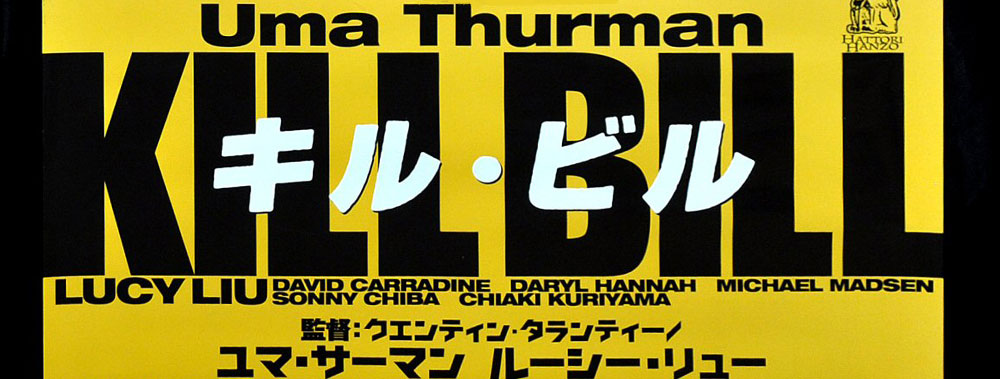
As previously discussed, there are so many influences that helped Quentin Tarantino build Kill Bill into the master piece it is. The main one however, is Lady Snow Blood, directed by Toshiya Fujita in 1973. So many elements of this film have been referenced by Tarantino that its quite incredible, in fact I think the thing that makes this not a remake, is that Kill Bill has so many other references that also contribute a lot to the film. It isn’t just cinematic...
BBC Winter Olympics Ident (Image, Motion, Sound)

The start of this project coincided with the start of the winter olympics, so recently on BBC the below video has been playing alot. Initially I was a very big fan, and from the point of view of the aesthetics I still am. It was commissioned by the BBC to play between programs breaks at intervals and in between other programs...
Quentin Tarantino (Image, Sound, Motion)
In the previous project Global Context, I really stayed away from looking at Japanese and American films that might be inspired by HKC, electing to focus primarily on HKC films solely. However as this is a new project altogether but linking to Global Context I thought I would start my secondary research by looking slightly further a field. in particular at films that have been inspired by HKC to get a better idea of how the visual language...